Case Study
The Grind
Greenery
The opportunity
Initially, The Grind was a cozy coffee nook located within a bicycle store. They approached us with the goal of breathing new life into their brand.
The solution
Our collaboration included a brand refresh, the creation of key brand elements, crafting an enticing menu design, and the addition of captivating illustrations to elevate their overall appeal.

Old The Grind Logo by a previous designer
The new The Grind by BrandHue.studio
Custom illustrations
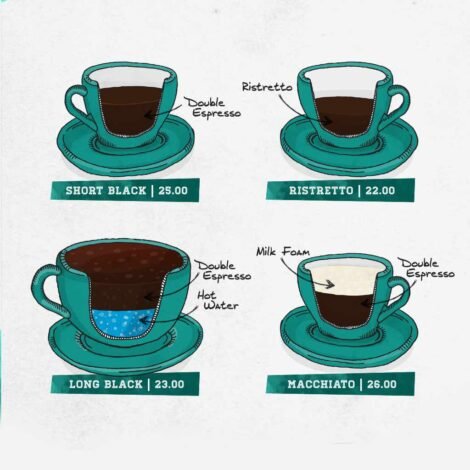
New menu design with custom illustrations
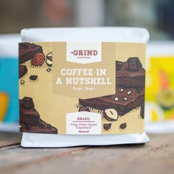
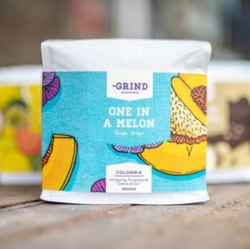
Illustrations that beautifully express the nuanced flavour notes of their coffee beans
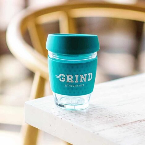
New logo on reusable take-away cup
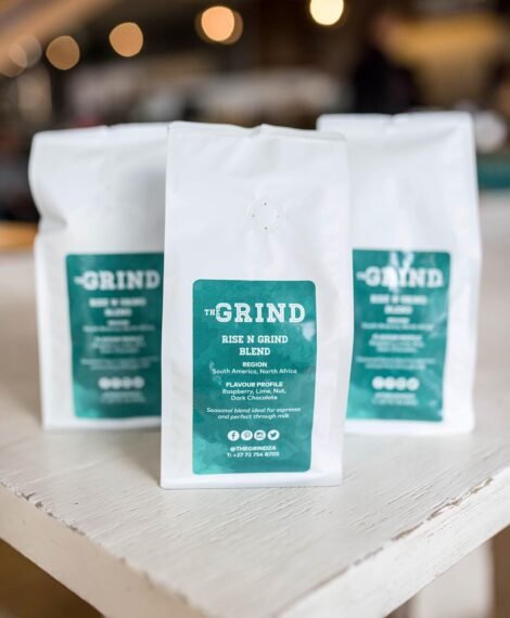
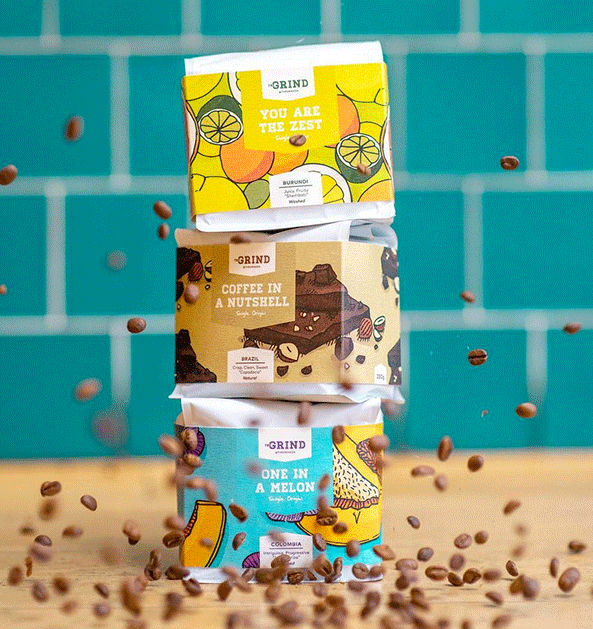
House blend packaging design
The Grind to The Grind Greenery
As The Grind expanded its horizons and ventured into the realm of full-fledged dining, with a strong emphasis on health and vegan choices, they approached us for assistance in devising a new name and brand identity that would perfectly embody this culinary evolution.
New name - The Grind Greenery
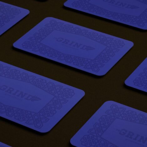
Business cards with custom pattern-logo

New cup design

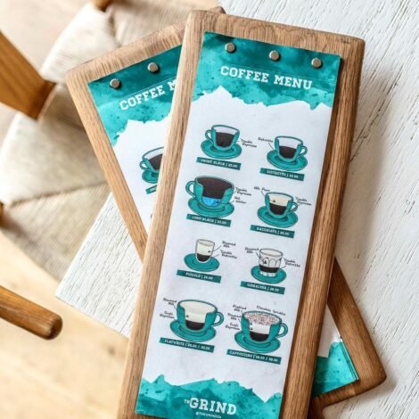
The Grind Greenery z-fold menu design
The Grind Greenery z-fold menu design

The Grind Greenery staff uniform
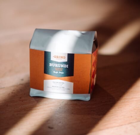
The Grind Greenery coffee packaging design
The takeaway
We've not only assisted our client in achieving a successful rebranding but have also had the privilege to collaborate on the full execution, encompassing print and digital media. Additionally, we played a crucial role in the successful launch of their website, contributing to their brand's overall success and growth.
Key players
Creative Director: Ruan Blignaut
Website Development: Heinrich Blignaut
Photography: Alexi Portokallis