Case Study
Louis & Beans
Coffee Roasters
Background
Louis & Beans, a fresh entrant into the world of coffee roasting, draws its unique name from the owner's beloved dogs, Louis and Beans. This endearing connection holds not only sentimental value but also encapsulates the essence of the brand's mission - to bring warmth, companionship, and exceptional coffee to its customers.
The owner envisioned a brand identity that would mirror the simplicity and strength of a great cup of coffee, with a clean and bold design that would leave a lasting impression.
The Challenge
Our challenge was clear: to create a brand identity that paid homage to the brand's canine namesakes while embodying the qualities of simplicity, boldness, and strength that are synonymous with a great coffee experience.
The Solution
The resulting brand identity was a clean and impactful logo that featured a stylized image of Louis and Beans. This minimalist yet bold design not only paid homage to the dogs but also represented the core qualities of the brand. The simplicity of the logo mirrored the purity of a perfectly brewed cup of coffee, while its boldness conveyed the strength and richness of flavour that Louis & Beans aimed to deliver.
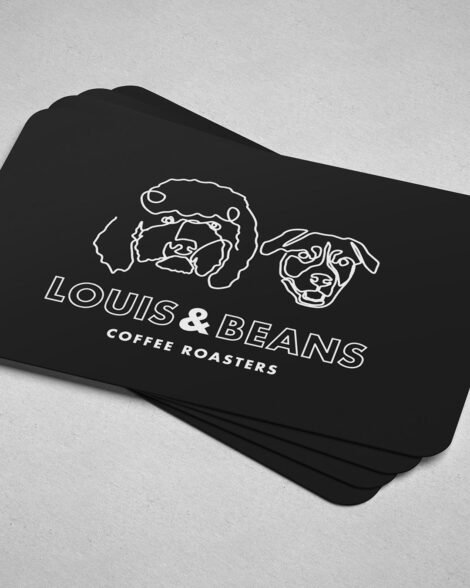
Business Card Design - Front
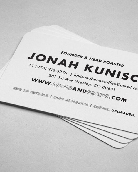
Business Card Design - Back
Louis & Beans Coffee Packaging Design
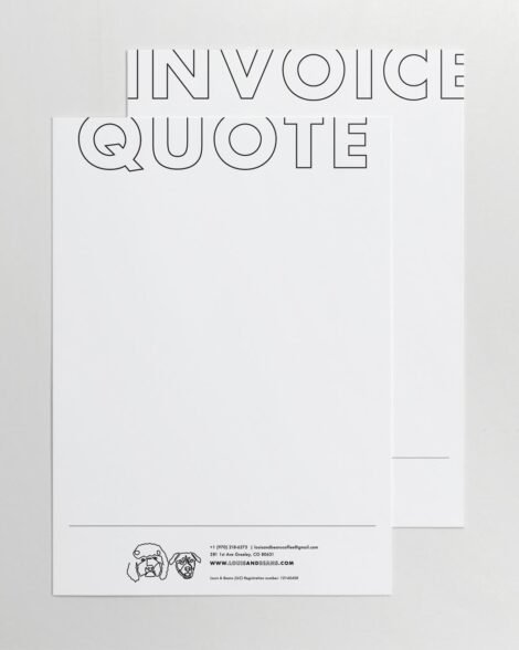
Stationary Design
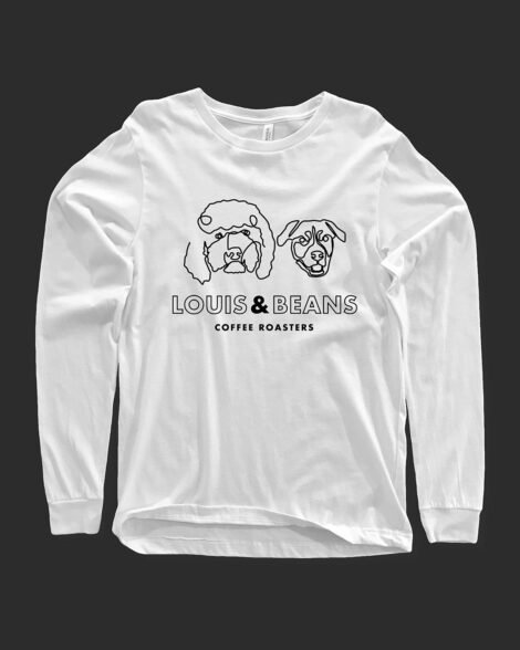
Louis & Beans Merchandise
Conclusion
Louis & Beans emerged as a testament to the power of branding. The brand's clean and bold identity captured the essence of a great coffee experience while paying tribute to the loyal companions that inspired its name. With its simple yet impactful design, Louis & Beans successfully entered the coffee roasting scene, ready to brew success and build lasting connections with coffee enthusiasts.
Key players
Creative Director: Ruan Blignaut
Inspiration: Louis & Beans