TIP 'N GO
Turning a pandemic problem into a fintech solution built for a safer, cashless future.

Ruan Blignaut
Creative Director


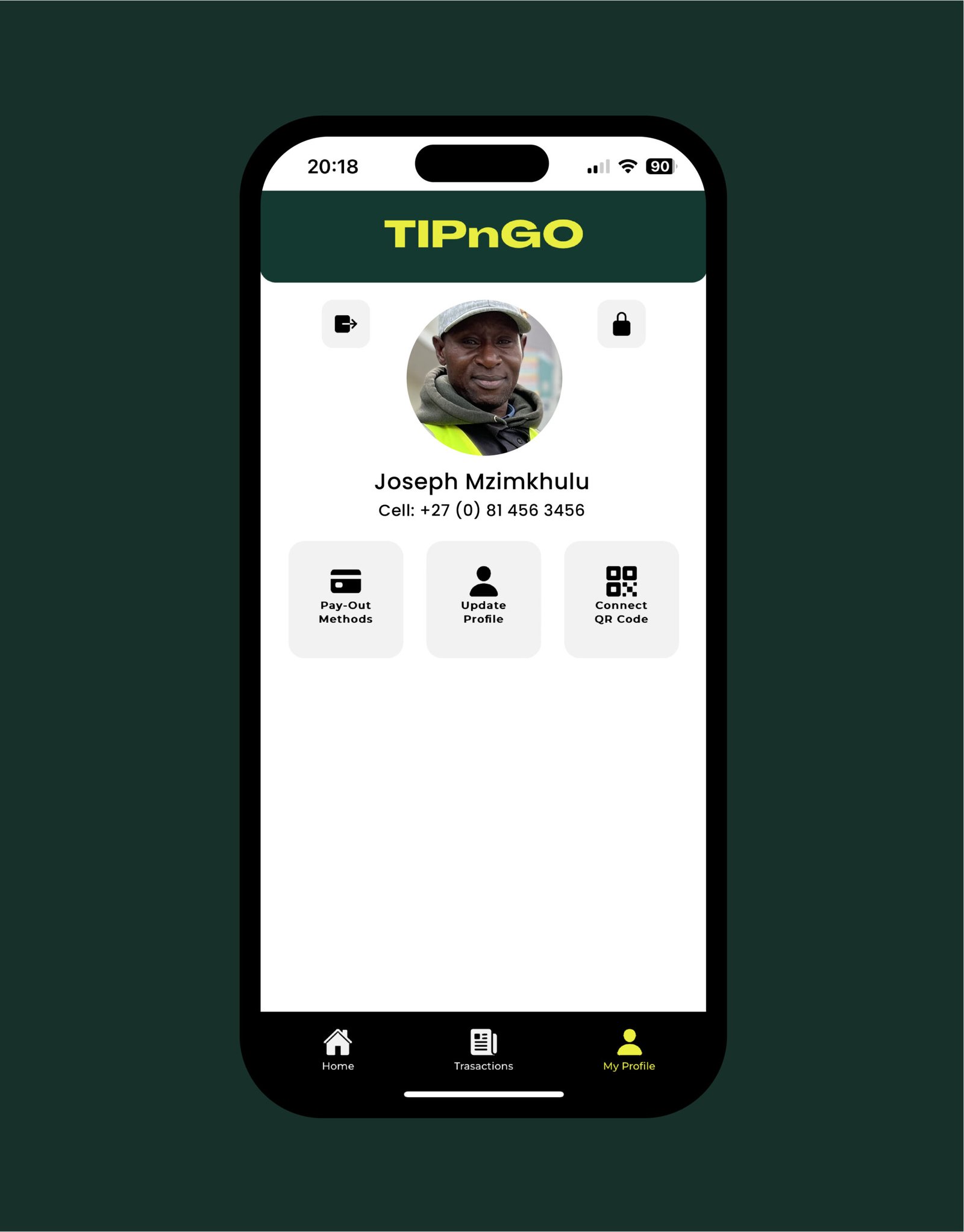
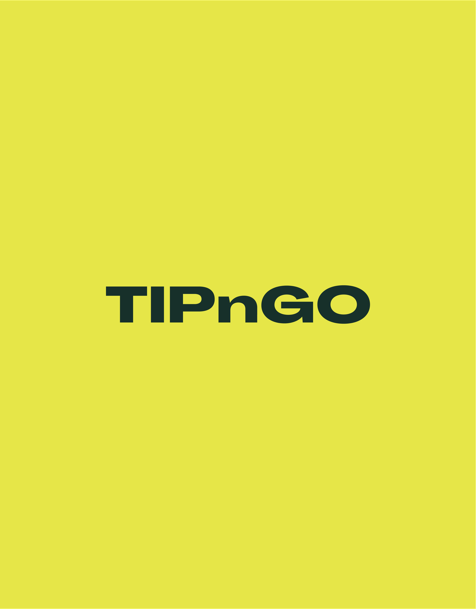
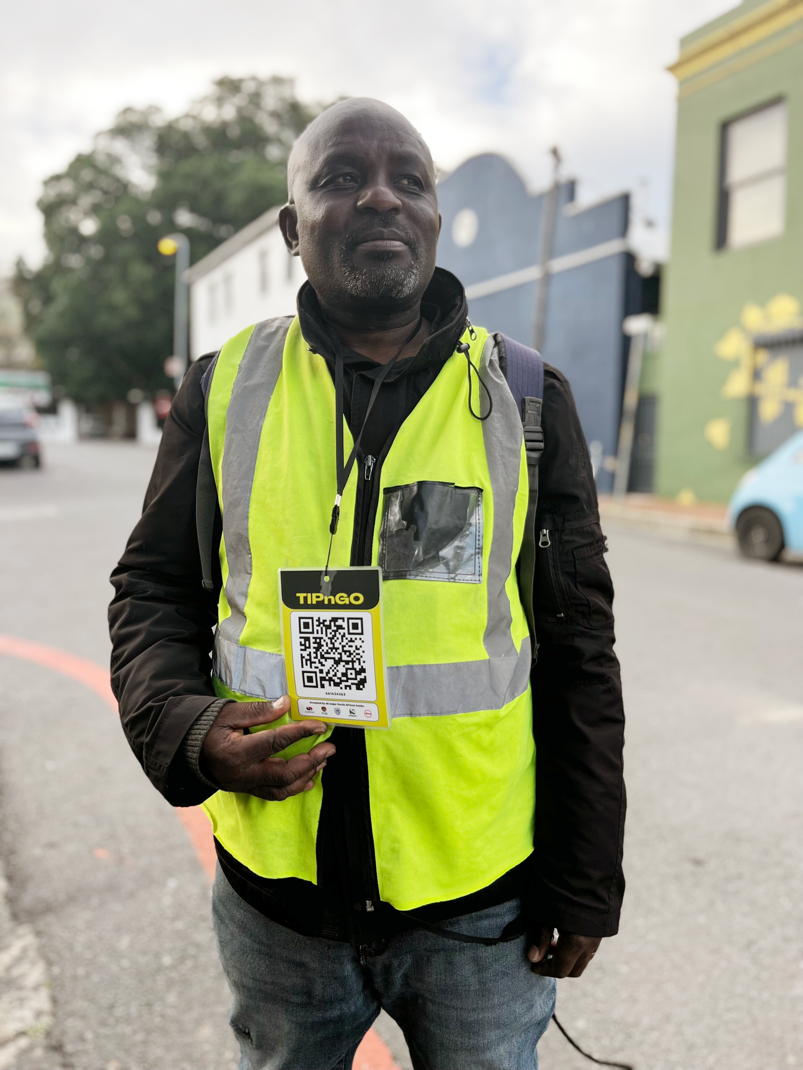
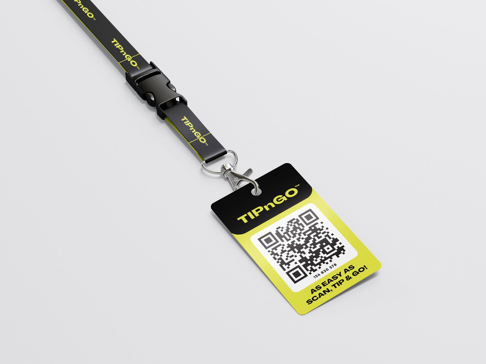
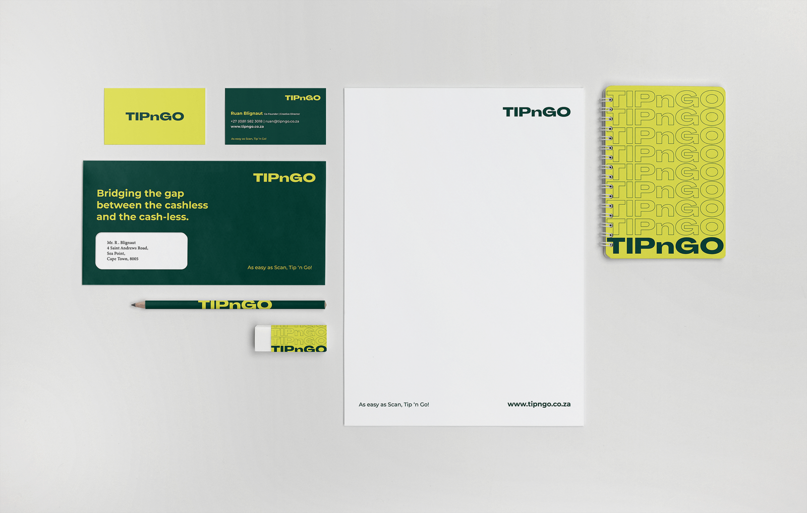
The choice of a bright fluorescent yellow was inspired by hi-visibility bibs worn by the security guards, a symbol of attention and safety. This bold yellow color immediately grabbed the viewer’s eye, conveying a message of clarity, alertness, and accessibility. It was a statement that TIPnGO was not just another financial company but one that stood out and demanded attention.
The logo itself was a harmonious blend of these two colors. It featured bold typography with the company name, TIPnGO, in uppercase letters, emphasizing the brand’s confidence and authority. The choice of fonts was modern and clean, ensuring clarity and readability.
Expertises
Other Work

